Print Festival Report
by David Rubin
Today I went to see Print Festival, at the International Print Center, at 524 W 26 St, Manhattan. It was an exhibit of print art by students.
There was so many good-looking prints, I didn’t know where to look first. I was also surprised at how simple some of the work was. Some of it was as simple as making a print of pressed dandelions and it looked great.
My favorite artist is Lizzy Itzkowitz, a cartoon art student at the School of Visual Arts. She’s been working at it for seven years, studying the Adobe Creative Suite. She’s worked on a variety of media, including gouache, acrylic, paper collage and digital. She does a lot of print pictures, as well as cartoon booklets. You can see her work at https://www.behance.net/lizzyitz
She screen printed a lot of designs and I love all the color, especially the cat. The
cat has three colors, neon pink, neon yellow and neon blue. All those blotches of neon curvy color make it seem quite happy, especially the large orange on yellow on his belly, which strikes me as much of a greeting as the raised left arm.
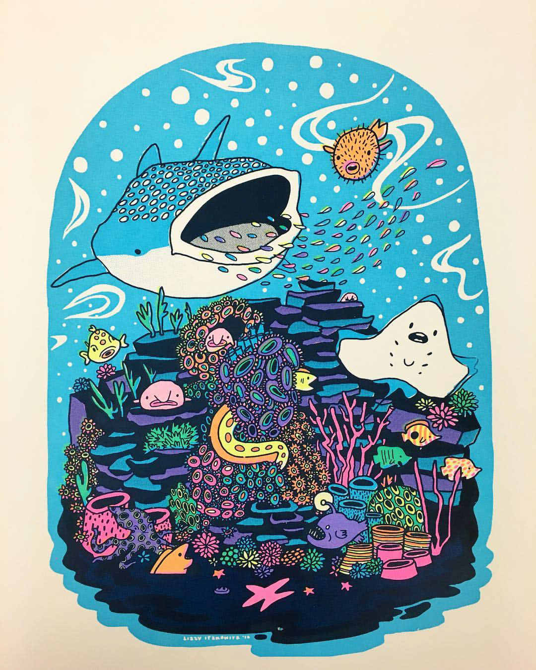
She also screen printed Cactus Terrarium, 11"X17", neon pink, neon yellow, neon blue and navy blue, and Coral Reef, same size and colors, done on a transparency, below. Like the cat, they are both beautiful because of all the bright, neon colors.
I like the looks of Coral Reef. There seems to be a lot of movement in that sky blue background.
As for Cactus Terrarium, as good as it looks, it looks out place without any background. I’d have printed it as being on a table, or something. It is on a transparency. Perhaps the background is whatever she puts it on. If it were me, I’d have painted a table and put the transparency on it, a multimedia.
Another piece I liked, to the right, is Monday’s 2016, by Kathleen Johnson. It’s a 28" X 29" woodcut. Clearly this belongs on the cover of Fantasy & Science Fiction magazine. It’s nothing but black lines on a white sheet. Allthose lines give it a lot of horrific detail, especially the thin lines on his face and nose. All that horror is emphasized by the thin black rays around it.